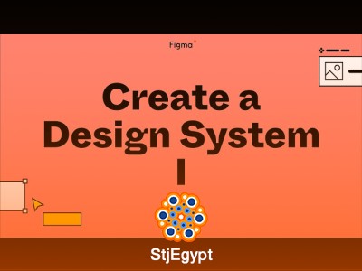

The Build it in Figma course is a step-by-step guide to mastering design systems and responsive UI design. Starting with the Foundations, you’ll learn how to organize your design workflow, define color palettes, typography, and spacing rules for consistent, scalable interfaces.
The Components modules dive deep into creating reusable elements like buttons, input fields, icons, and UI patterns, ensuring that designs are both modular and flexible. Testing lessons show how to validate your components across different screens and interactions, while the Documentation section teaches how to create clear, shareable guides for teams and clients.
The course also emphasizes responsive web design, guiding you through designing navigation bars, full web pages, and resizable forms that adapt to different devices. Advanced modules focus on app design, including conceptualizing a book app for designers, exploring visual layouts, and refining interactions for professional use.
By the end of the course, learners will have a complete understanding of how to build scalable, maintainable, and visually consistent design systems in Figma, suitable for both web and mobile applications.