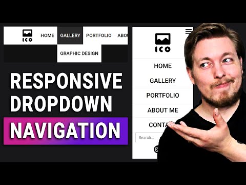
Easy Responsive Dropdown Navigation with HTML & CSS – Beginner Tutorial
عدد الدروس : 1 عدد ساعات الدورة : 01:19:57 شهادة معتمدة : نعم التسجيل في الدورة للحصول على شهادةللحصول على شهادة
- 1- التسجيل
- 2- مشاهدة الكورس كاملا
- 3- متابعة نسبة اكتمال الكورس تدريجيا
- 4- بعد الانتهاء تظهر الشهادة في الملف الشخصي الخاص بك
قائمة الدروس
عن الدورة
This tutorial teaches you how to create a responsive dropdown navigation menu from scratch using HTML and CSS, perfect for beginners in web development. You’ll start by structuring the HTML with semantic elements, including <nav>, <ul>, and <li> tags, to create a clean and accessible menu.
Next, you’ll learn how to style your navigation bar with CSS, including colors, typography, spacing, hover effects, and transitions. The tutorial also demonstrates how to make your dropdown menu fully responsive, adapting to different screen sizes and mobile devices. You’ll see how to use CSS media queries to adjust layouts for smaller screens and ensure the menu remains functional and visually appealing.
By the end of the tutorial, you’ll have a professional-looking dropdown navigation bar that works on desktops, tablets, and mobile devices. This practical skill is essential for building modern websites and enhancing user experience.


